Post by boothead on Apr 4, 2011 11:03:26 GMT -5
Hi, I have a few friendly ideas.
I think the main LSB site looks pretty good, but there are a few things I think could be improved. In Firefox, the header of the site doesn't align with the rest of the body. Not sure about other browsers.
Another thing I noticed is that you're using a background image for the body of your website:
The problem with this is that the body can't expand to conform to fit size of the browser. For people with higher resolution monitors, there will be a huge white space on the right side of the page. It might be a little bit of work, but if you could figure out how to convert to an auto-scaling CSS layout, things would look a lot more fluid. Using the gradient feature of CSS would also enable you to have the black-to-white gradient extend all the way to the bottom of the page. It looks kinda funny with the text and features extending way past where the gradient cuts off.
For the most part, though, the design looks great. My only major gripe is that this forum is running on ProBoards software. It is ugly and terrible and doesn't match the professional look of the rest of the site. Switching to a different forum software and hosting it on your own would also allow you to not rely on ProBoards' unreliable servers. A few of the better softwares require paid licenses, but this is the internet, and that sort of thing can always be worked around . If you'd like to explore alternatives, that's something I could help with. As far as the coding on the main page, you might need to find someone more experienced than myself.
That is all.
I think the main LSB site looks pretty good, but there are a few things I think could be improved. In Firefox, the header of the site doesn't align with the rest of the body. Not sure about other browsers.
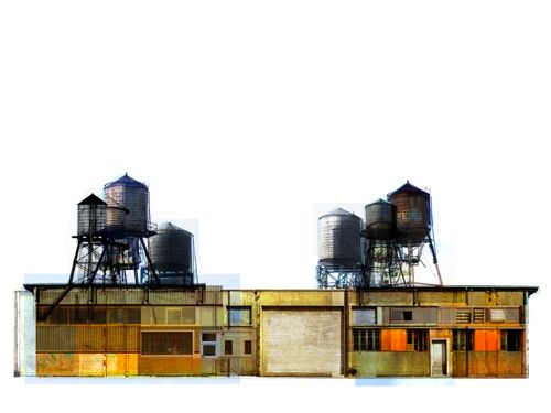
Another thing I noticed is that you're using a background image for the body of your website:
http://www.lifessweetbreath.com/photos/background.jpgThe problem with this is that the body can't expand to conform to fit size of the browser. For people with higher resolution monitors, there will be a huge white space on the right side of the page. It might be a little bit of work, but if you could figure out how to convert to an auto-scaling CSS layout, things would look a lot more fluid. Using the gradient feature of CSS would also enable you to have the black-to-white gradient extend all the way to the bottom of the page. It looks kinda funny with the text and features extending way past where the gradient cuts off.
For the most part, though, the design looks great. My only major gripe is that this forum is running on ProBoards software. It is ugly and terrible and doesn't match the professional look of the rest of the site. Switching to a different forum software and hosting it on your own would also allow you to not rely on ProBoards' unreliable servers. A few of the better softwares require paid licenses, but this is the internet, and that sort of thing can always be worked around
 . If you'd like to explore alternatives, that's something I could help with. As far as the coding on the main page, you might need to find someone more experienced than myself.
That is all.